25 Feb 2014
by minkrancher
in conceptual art, mail-art, mail-art calls, object poetry, post-neo
Tags: concept art, correspondence, events, mail-art, post-neo

MinXus designer comb by Empress Marie

MinXus designer comb by Empress Marie
Contestants in the MinXus-Lynxus Who Has The Best Contest are eligible to win a wide range of exciting prizes. Empress Marie Antonette (aka Marie Wintzer) has created a line of MinXus combs, and she has generously agreed to donate a number of them as contest prizes. Yes, YOU could be the recipient of a FAB MinXus comb. The opportunity of a lifetime.
17 Feb 2014
by minkrancher
in asemic fiction, asemic poetry, asemic writing, books, calligraphy, collage, conceptual poetry, concrete poetry, Fluxus, mail-art, minimalism, object poetry, poetry, stamps, visual poetry
Tags: asemic fiction, asemic poetry, asemic writing, asemics, calligraphy, collage, conceptual poetry, conceptual writing, fluxus, haptic poetry, mail-art, object poetry, visual poetry

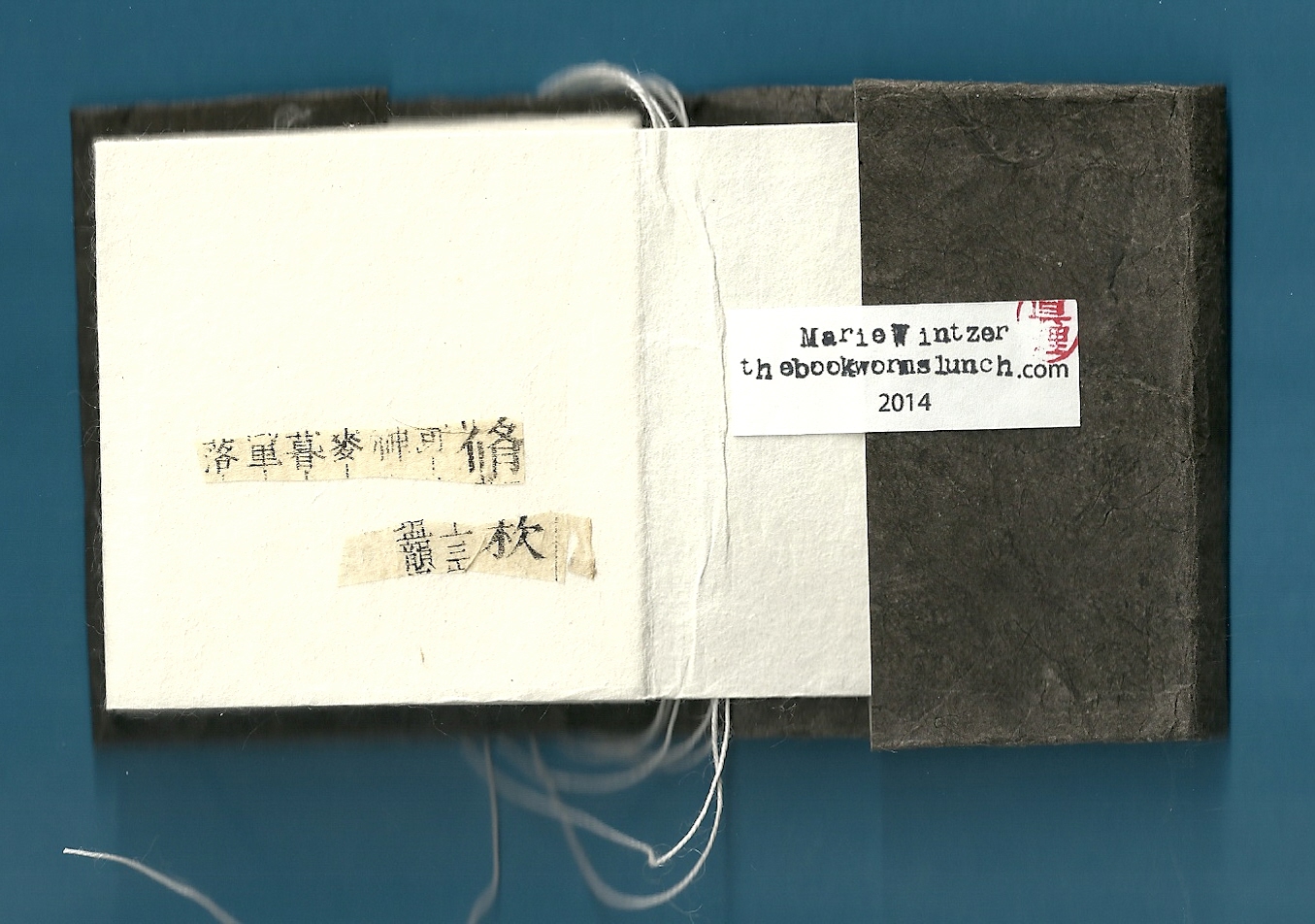
Letters to Mila III (cover) by Marie Wintzer (Saitama, Japan)
Her friends were deeply saddened when, at the beginning of the year, Marie Wintzer – aka Empress Marie Antonette – announced her retirement from mail-art after a three year run which, by anyone’s measure, would be considered exceptional. Marie expressed her intention to more seriously pursue making artists books.
We recently received Letters to Mila III from her, which showcases her talents. Mail-art from Marie Wintzer has surfaced in various places recently, and she is serving as judge for the MinXus-Lynxus Who Has The Best Hair Contest. Does she miss the roar of the greasepaint and the smell of the crowd? Like Elvis, will she come back again? Only time will tell. In the meantime, we are thrilled to share Letters to Mila:

Letters to Mila is a small, delicate book that is meticulously made. These scans simply do not capture its beauty.

Marie Wintzer has been experimenting with cut-ups and text fragments for some time. Japanese is a new twist.

Letters to Mila is bound in what we believe is called the accordion style, so one can view page combinations in different ways.

This page with a splash of red is particularly nice.

She is a true disciple of the South African School of Subtle Aesthetic Obscurity even if she has developed her own distinctive style.

Letters to Mila uses language as material and certainly has an asemic quality. Above is the last page and the inside back cover.
Other material was also included with Letters to Mila:

And the reverse:

An interesting photo:

A poem on the reverse side:

And always wonderful envelopes from Marie:

The other side:

An extraordinary talent indeed, blending the old with the new – many thanks to Marie!
16 Feb 2014
by minkrancher
in anti-art, anti-poetry, asemic poetry, conceptual art, conceptual poetry, Fluxus, found art, haptic poetry, holism, mail-art, minimalism, object poetry, poetry, Trashpo, visual poetry
Tags: asemic poetry, asemics, concept art, conceptual poetry, conceptual writing, correspondence, fluxus, found art, holism, mail-art, trashpo, visual poetry

Mail-art by Richard Canard (Carbondale, Illinois, USA)
The international mail-art network has long been a friend to intermedia work that stretches the boundaries of traditional poetry, such as visual poetry. This piece recently received from Richard Carnard is a weather-worn label he found outside his local post office.

Richard poses a Socratic question, and we are only too willing to respond. From our humble perspective, this work (a kind of natural erasure) could certainly be considered Trashpo; and Trashpo, by definition, is a form of vispo: visual poetry.
We also detect something else at work here or are at least we are reminded of another mail-art connection. The Japanese Gutai group has long been influential in mail-art. Among other concepts, the Gutai group was interested in the disintegration that take place in art over time.
http://www.guggenheim.org/new-york/exhibitions/past/exhibit/4495
Richard Canard, by selecting found material in an advanced stage of disintegration, asks us to consider the materiality of “art” and its precarious relation to absence or nothingness.
Of course, this is only one of a multitude of possible interpretations a thoughtful receiver will find when engaging with this thoughtful work.
11 Feb 2014
by minkrancher
in asemic fiction, asemic poetry, asemic writing, At the Mink Ranch, calligraphy, collage, conceptual art, found art, haptic poetry, mail-art, neoism, object poetry, performance art, post-neo, stamps, Trashpo, visual poetry
Tags: asemic fiction, asemic poetry, asemic writing, asemics, at the mink ranch, calligraphy, collage, concept art, conceptual art, correspondence, found art, haptic poetry, mail-art, neo, neoism, object poetry, performance art, post-neo, trashpo, visual poetry

Mail-art by Rebecca Guyver (Suffolk, UK)
Our close friend and brilliant correspondent Miss Becca sent a care package to Dark wall that contains an eclectic mix of DKult (Trashpo) and MinXus mail-art. Dark wall is involved in both efforts and helps prepare the DKULTNY Trashpo Fanzine. Included in the last issue was a Trash-&-Pass, which Miss Becca has returned with marvelous embellishments. You can see the entire piece above. Other than the pics of DK and Dark wall, the work is almost completely composed of Miss Becca’s additions. Material was also stapled to the Trash & Pass, which we have carefully removed and scanned separately. We find the green panel with asemic symbols particularly attractive:

The next scan shows materials that were stapled to or included with the Trash & Pass:

The piece on the left is the “dyed lintpo” mentioned in the top scan. “Lintpo” might require some explanation for Tenderfoots. For a time, the revered visual poet John M. Bennett (JMB) seemed caught in a loop concerning lint. He consistently posted the words “fork lint” in discussions, and lint appeared in his work. JMB is vastly influential – this is an absolute truth – and soon fans, copycats and vispoets seeking new territory were producing lintpo: lint poetry inspired by JMB. The Fork Lint Society was organized. Nowhere is the creation of lintpo more energetic and innovative than among Trashpoets, and Miss Becca has added to the canon with this lint object poem. Sadly, Rancher’s first remark to Dark wall upon seeing the lintpo was: “Dw, why’n Miss Becca send you one of them cat fur balls all stitched up? We got no room for cats in the Bunk House.”

As seems customary these days – and much appreciated – Miss Becca included a (British?) cowboy song book (1930s?!). Some Tenderfoots might not realize the Mink Ranch/cowboy concept is derived from Edward Dorn’s long poem Gunslinger aka Slinger (also see Tom Clark’s excellent biography of Dorn: A World of Difference.) Marvelous text awaiting appropriation:

The package came in a large, wonderfully decorate envelope:

Incredible! The reverse:

Many thanks to correspondent and friend Rebecca Guyver!
03 Nov 2013
by minkrancher
in anti-art, asemic writing, calligraphy, collage, conceptual poetry, experimental writing, found art, mail-art, object poetry, Trashpo, visual poetry
Tags: asemic writing, asemics, calligraphy, collage, conceptual writing, correspondence, mail-art, trashpo, visual poetry

Mail-art by Claudia McGill (Wyncote, Pennsylvania, USA)
Dear friend and ever-faithful correspondent Claudia McGill sent us this brilliant piece that favors our own interest in asemic writing that is composed, at least in part, on a randomness principle.
As we hope the scan reveals, Claudia composed this postcard-size work by overlaying strips of (mostly) cursive writing in a relatively linear pattern upon a foundation of more cursive writing. We note that this “cut-up” technique (see William S. Burroughs) was employed by a number of artists who participated in the monumental Asemics 16 collaborative book project in 2011-12. This process creates new symbols and textual forms, all of which could not possibly have been anticipated. We find the result very impressive.
Friends know that Claudia McGill is capable of using an astonishingly wide range of aesthetic approaches to produce pleasing results. For this piece, she looks back to her gritty roots in the Trashpo, anti-art school. In fact, this work bears some similarity to the 2005 Trashpo compositions by visual poet Jim Leftwich (Virginia, USA) that launched the recent Trashpo craze (along with the work of Diane Keys (Illinois, USA).
To speak frankly with our intrepid readers, it is our opinion that the more formalist approaches to cut-up asemics are less successful than the anti-art sensibility. This is likely due to the fact that the formalist approach is less conducive to the integration and synthesis necessary to create a new language (or more properly the suggestion of a language) built on an existing language.

Many thanks to Claudia McGill for sending work for the growing asemic collection.
02 Nov 2013
by minkrancher
in anti-art, anti-poetry, conceptual art, conceptual poetry, concrete poetry, Da Da, Fluxus, found art, haptic poetry, mail-art, minimalism, object poetry, performance art, Trashpo, visual poetry
Tags: concept art, conceptual art, conceptual poetry, conceptual writing, concrete poetry, correspondence, fluxus, found art, holism, mail-art, mail-art psychic, trashpo, visual poetry

Mail-art by Skybridge Studios (North Manchester, Indiana, USA)
Bagism became part of popcult thanks to the efforts of Yoko Ono and John Lennon. Their media appearances wearing large (often black) bags are classics today. Of course, we know they were only bringing to a larger audience a practice that had already been well-established by Fluxus. Bagism is also a well-established practice in mail-art.
So we were thrilled to receive this classic Bagist mail-art from our dear friend and correspondent Miss Lisa from In Diana. What a joy to take part in the performance and discover the precious cargo:

What a Fluxus treasure! Two water-smoothed pebbles from the beach! How Fluxus! They have no material value, no metaphorical value, no artworld value – yet – the great paradox – they are a treasure! They are gifts from a dear friend, they are jewels if one just takes time to explore and interact with them. (We do know, for the sake of full disclosure, they were gathered by Miss Lisa on a trip to a very beautiful beach and lake; and she has, by extension, included us in the experience. A privilege indeed!)

Thanks Lisa, for the early Christmas present?
09 Oct 2013
by minkrancher
in asemic fiction, asemic poetry, asemic writing, calligraphy, collage, conceptual poetry, experimental writing, found art, haptic poetry, mail-art, object poetry, Trashpo, visual poetry
Tags: asemic fiction, asemic poetry, asemic writing, calligraphy, collage, conceptual writing, correspondence, experimental writing, found art, haptic poetry, mail-art, trashpo, visual poetry

Mail-art by Nancy Bell Scott (Old Orchard Beach, Maine, USA)
Nancy Bell Scott in New England sent us a stunning missive with wonderful examples of her immediately recognizable work. Above is an altered book page with her beautiful asemic writing and abstract artwork. Like many of us, Nancy developed her technique in the Martha Stuart School of Asemic Wallpaper, which inspired many participants to produce vispo-asemic hybrid pieces collected in the Asemics 16 collaborative books. Here is the reverse side:

Nancy Bell Scott’s interest in and appreciation of old books contributes to her aesthetic. A very special part of the mail-art she sent is the inclusion of her “3-scrappers.” We expressed some interest in this work, and she generously sent a half-dozen examples. The composition of “3-scrappers” is a chance operation process that provides a form while leaving open the possibility of infinite combinations. Here is her explanatory note:

And here are the 3-scrappers we are so thrilled to be able to place in the MinXus USA Archives:

What extraordinarily beautiful object poems! Nancy Bell Scott’s use of old texts and materials bring a wide historical range to her work which is transformed from its context with her colourful, abstract expressionist inspired painting and drawing. Here is what is on the reverse side of the pieces above:

Nancy Bell Scott’s envelopes are always a treat:

Reverse:

We are absolutely thrilled to add 3-scrappers to the collection and offer our most sincere thanks to Nancy Bell Scott.
01 Oct 2013
by minkrancher
in asemic fiction, asemic poetry, asemic writing, books, calligraphy, collage, conceptual art, experimental writing, found art, haptic poetry, mail-art, object poetry, post-neo, Trashpo, visual poetry
Tags: asemic fiction, asemic poetry, asemic writing, asemics, calligraphy, collage, conceptual art, conceptual writing, correspondence, experimental writing, found art, haptic poetry, mail-art, post-neo, trashpo, visual poetry

Mail-art by meeah williams (Brooklyn, New York, USA)
In August, meeah Williams sent us this wonderful package of mail-art that we now, at long last, are thrilled to share with you. Here at the ranch, we are huge Antonin Artaud fans, so meeah’s boekie, “Birdwatching with Antonin Artaud,” is greatly appreciated. Here are the panels:

Throughout the package, meeah Williams incorporates found material, cut-ups, asemics and (disrupted) visual narrative.

meeah also included a wonderfully done, recycled cd or dvd:

meeah certainly showcases her mastery of Trashpo in this outstanding piece.

Also included is this asemic-vispo page that might be an add-and-pass.

Here is a closer-in scan:

A little W.S. Burroughs paranoia is evident in the virus piece. The envelope is also a masterpiece:

And the reverse:

Deepest thanks to Mink Ranch fav, meeah Williams!
Previous MinXus-Lynxus post with work by meeah Williams:
https://minxuslynxus2.wordpress.com/2013/08/20/minxus-mail-bag-asemic-writing-from-meeah-williams-brooklyn-new-york-usa/
11 Aug 2013
by minkrancher
in anti-poetry, asemic poetry, asemic writing, calligraphy, collage, conceptual poetry, concrete poetry, experimental writing, Fluxus, haptic poetry, object poetry, poetry, visual poetry
Tags: asemic poetry, asemic writing, asemics, collage, conceptual poetry, concrete poetry, object poetry, poem, poetry, visual poetry
http://poooooemas.blogspot.com/2013/08/aos-colaboradores-do-blog-ooooo.html

“asemic vispo in part” by Cheryl Penn (South Africa)
Includes Michael Orr, Fatima Querioz, Avelino de Araujo (MinXus gives 5 stars on this guy), Rosa Gravino, De Villo Sloan, Cheryl Penn, Brion Gysin, Cy Twombly & more
20 Jun 2013
by minkrancher
in anti-art, anti-poetry, asemic writing, books, calligraphy, collage, conceptual art, concrete poetry, experimental writing, found art, haptic poetry, mail-art, object poetry, Trashpo, visual poetry
Tags: asemics, at the mink ranch, calligraphy, collage, concept art, conceptual art, concrete poetry, found art, haptic poetry, mail-art, object poetry, trashpo, visual poetry

Mail-art by WA Rodgers (Takoma Park, Maryland, USA)
WA Rodgers is a newcomer to the Eternal Network, and we offer her a warm welcome. We have seen scans of her work posted at the EUOMA and find it highly distinctive and fascinatingly cryptic in both word and image.
WA Rodgers expressed an interest in Trashpo and has delved into it with depth, intensity and insight. This boekie we are thrilled to have received from her easily fits the definition of Trashbook, based on her ingenious use of found material. This is a three-fold work with a total of six frames (pages). Among book artist friends, we are known (notorious) for not doing well with linear documentation. So we will try to compensate by presenting scans that show the two panels, all six pages and some close-ins.

WA Rodgers’ boekie came in this elegant wrapper.

My favourite part of the work is the panel (full scan at the top; one frame here) that displays waded up trash paper that appears to be in the process of disintegration (but is in actuality preserved in situ). This reminds me of paper mache. Much Trashpo you see is sanitized and in an excellent state of preservation. This only makes sense and is indeed only polite when you consider the work is being mailed to someone. Yet anyone who has participated in the ritual of gathering material in the streets to create Trashpo knows that it is often a grimy, gritty and dirty business. Thoughtlessly discarded consumer trash is a blight, and it becomes moreso as nature seeks to reclaim it. The genius of WA Rodgers in this boekie is that she captures this aspect of decomposing trash, giving it an unusual realism.

The Japanese Gutai Group – so influential in mail-art – was interested in the process of decay, decomposition and change that inevitably occurs in a work of art over time. Gutai emphasized the physical nature of these changes; this concept also has a metaphorical dimension that can be applied to text and image. WA Rodgers has a Gutai sensibility in this remarkable work.
http://en.wikipedia.org/wiki/Gutai_group
This section of the piece also incorporates text with writing, further establishing its Trashpo connection. In this state of decomposition, some very interesting effects are achieved related to asemics and vispo:

In particular, this close-in reveals the breakdown and distress of the paper has produced a text only partially intelligible. Nature is (or chemistry?) is responsible for the erasure. This might be considered a kind of eco-asemics.

This frame shows more juxtaposition of materials. The process of decomposition, if anything, is highlighted even more by the strip of colour that is considerably more intact than the paper.

WA Rodgers has only given herself two panels and six frames in this work, yet she manages to be astonishingly versatile. This part of the boekie incorporates a more recognizable Trashpo collage style. The emphasis on image is pronounced, although – for instance – the red letters provide some interesting minimalist Trashpo in the classic style.

Here is a close-in. The book is highly interactive. Many different image/text combinations can be achieved by enfolding and unfolding the pages beyond what has been offered in these scans. The Trashbook was enclosed in an intriguing envelope:

Reverse:

Many thanks to WA Rodgers for this stunning and original work!
Previous Older Entries Next Newer Entries