27 Aug 2015
by minkrancher
in anti-art, anti-poetry, asemic poetry, asemic writing, calligraphy, collage, conceptual art, conceptual poetry, concrete poetry, events, experimental writing, found art, haptic poetry, mail-art, mail-art calls, object poetry, performance art, poetry, post-neo, Trashpo, visual poetry
Tags: asemic poetry, asemic writing, asemics, calligraphy, collage, concept art, conceptual art, conceptual poetry, conceptual writing, concrete poetry, correspondence, experimental writing, found art, haptic poetry, mail-art, object poetry, performance art, post-neo, trashpo, visual poetry

Mail art by Jim Leftwich and Evan Damerow (Roanoke, Virginia, USA)
This summer we received two large packages of mail art from visual poet Jim Leftwich in Roanoke, the first of which (chronologically) we are documenting in this blog. The vast majority of the pieces are collaborations between Jim Leftwich and Evan Damerow. (The exception is one very interesting asemic work at the end.) According to Facebook, Evan Damerow resides in New Zealand. His work was unknown to us before the arrival of this missive.
While Jim Leftwich seems to us inclined toward the prolific naturally, we attribute some of this outpouring of work this summer to the 2015 Marginal Arts Festival. The event seems to have been a great success and a perusal of the documentation will be rewarding to Tenderfoots, no doubt:
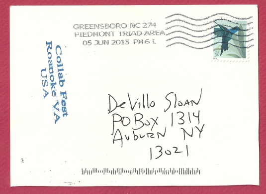
The Anti-Brain Rot mail art call and exhibition also accompanied the festival, which occurred in July (2015). Here is some partial documentation of the entries via C. Mehrl Bennett (Columbus, Ohio, USA):
The ANTI-BRAIN ROT mailart exhibit

Unless otherwise indicated, all the pieces shown here are Jim Leftwich-Evan Damerow collabs.
These Leftwich-Damerow collabs hold specific interest to the trashpoets and D-Kulters in the network (many of whom are rabid followers of our humble blog), as Jim Leftwich is acknowledged as having created some of the earliest Trashpo (2005). These pieces (the current work shown here) use found material, have the organic structure so recognizable in most Trashpo and also show the anti-art stance and the On the Road spontaneity of Trashpo composition.
Trashpo is a form of visual poetry. (Many current practitioners are either unaware of or disregard this fact). The pieces documented here make abundant and innovative use of text, text-image associations and juxtapositions, cut up, disruption, asemics and other approaches that are related to poetry and the poetic as well as the tenets of Trashpo rather than mere collage. In short, they are excellent examples. The work transcends Trashpo in many ways yet still offers insights into Trashpo theory and practice for the working trashpoet.


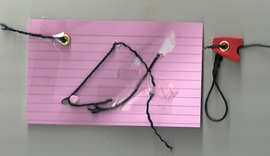
A bonus in the package was the piece below: “Spirit Writing” by Jim Leftwich (1997), a piece of historical significance because it was made so early in the context of the current thriving and burgeoning asemic movement. Jim Leftwich, however, and as many know, has reservations concerning the use of the term “asemic” and having his own work labeled as asemic writing. So we encourage Tenderfoots to consider the perspective of visual poetry here, although we believe the tide of history is very likely to identify Jim Leftwich as an asemic writer (among other designations):

A closer look:


Many thanks to Jim Leftwich and Evan Damerow!
23 Aug 2015
by minkrancher
in anti-poetry, asemic poetry, asemic writing, books, calligraphy, conceptual poetry, experimental writing, mail-art, poetry, visual poetry
Tags: asemic poetry, asemic writing, asemics, calligraphy, conceptual poetry, conceptual writing, correspondence, experimental writing, mail-art, visual poetry

Mail art by Jason Motsch (Conneaut Lake, Pennsylvania, USA)
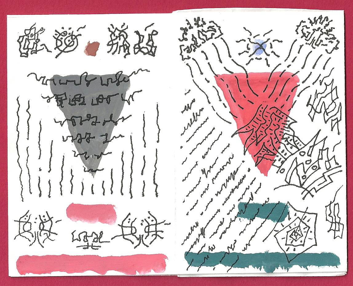
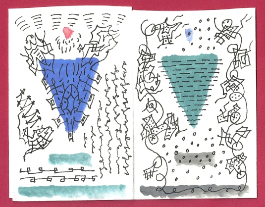
The Tacky Little Pamphlet (TLP), a mail art staple, is an ideal vehicle for asemic writing projects. Certainly prize examples can be found in the massive body of John M. Bennett’s (Ohio, USA) work, among others. Now Jason Motsch has made another contribution to the genre with this wonderful piece he sent us. The opening scan is the cover. The pages are approximately 2 X 3 inches, and he faithfully follows the “official” TLP folding pattern. Here are the inside pages:
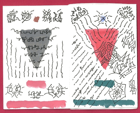
This is a very free form, calligraphy-based asemic writing, somewhat traditional compared to current, exotic methods for generating symbols.

This asemic TLP by Jason Motsch, as with most asemics that travel through the mail art network, is actually asemic-vispo hybrid work. The colorful triangles provide a useful continuity and anchors for the organic, apparently spontaneous writing.
And the back cover:
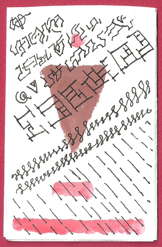
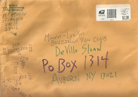
The TLP provides a brief yet sustained asemic cycle. As language is suggested, so is the structure of a lyric poetry cycle. We find the work interesting and engaging. Here is the envelope:

And the reverse:

Many thanks to Jason Motsch for sending more excellent asemic writing and vispo!
07 Aug 2015
by minkrancher
in anti-art, anti-poetry, calligraphy, collage, conceptual art, conceptual poetry, Fluxus, mail-art, mail-art calls, poetry, stamps, Trashpo
Tags: calligraphy, collage, conceptual art, conceptual poetry, conceptual writing, correspondence, mail-art, poetry, stamps, trashpo
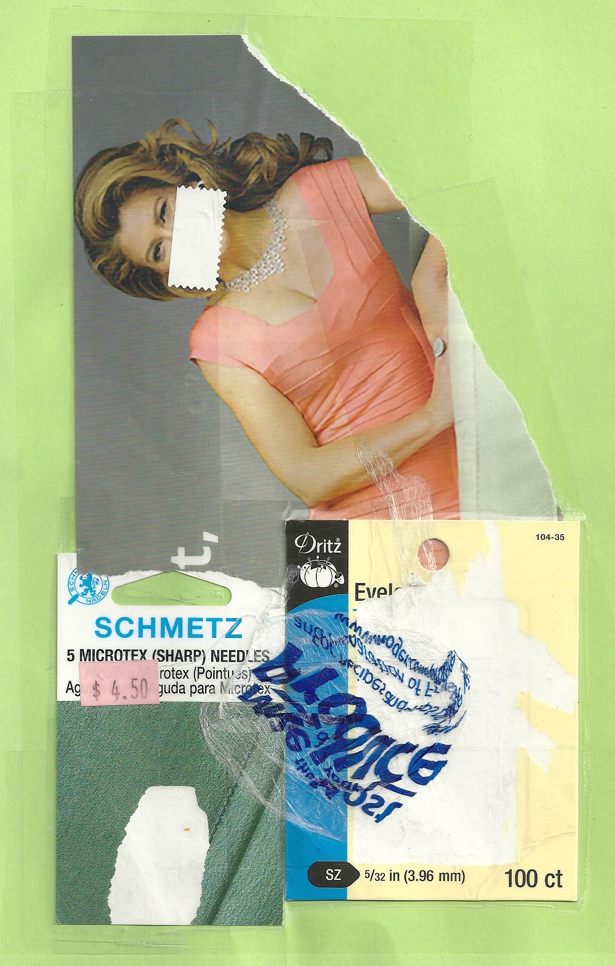
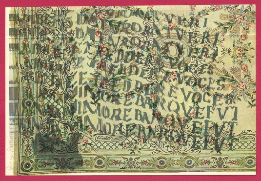
Mail art by Ruud Janssen (Breda, Netherlands)
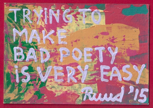
This Richard Canardesque card we received from Ruud Janssen is very thought provoking in terms of some of the Eternal Networkers whose work we follow closely. Specifically, Diane Keys (Elgin, Illinois, USA) has founded the Museum of Bad Mail Art (MOBMA), which is very popular and consistently attracts work. Moan Lisa is currently inhabiting the Maria Marisot identity (Iowa City, Iowa, USA). Moan-Maria has a particular genius for founding movements and issuing mail art calls that generate widespread interest and responses. One of them is Bad Poetry:
https://www.facebook.com/groups/853769131332573/
http://iuoma-network.ning.com/group/badpoetry

We greatly appreciate more DKULTN and Trashpo stamps, and Trashpo is relevant to the current discussion. But back to the main topic: We have kept some distance from both the Bad Poetry and Bad Mail Art calls because we are perplexed about defining what is “good” and what is “bad” in the context of mail art, especially when anti-art and found art are factored in. We are not against Bad Poetry or MOBMA; we are just confused. Ruud Janssen’s card suggests to us that we are not the only ones trying to define “bad poetry.” Is it good bad poetry? Is it bad good poetry? We do not know. We do know we are pleased to receive a great deal of poetry from Moan-Maria. But is it good? Is it bad?

Mail art by Maria Morisot (Iowa City, Iowa, USA)

Mail art (plasticized) by Moan Lisa-Maria Morisot (Iowa City, Iowa, USA)

We can offer no insight in terms of helping to identify bad art or bad poetry. Perhaps the insinuation of the question is what is important. We will, however, conclude with the insights of Richard Canard that often address these issues:

Mail art by Richard Canard (Carbondale, Illinois, USA)

Many thanks to Ruud Janssen, Maria Morisot, Moan Lisa and Richard Canard.
06 Aug 2015
by minkrancher
in anti-art, anti-poetry, collage, conceptual art, concrete poetry, Da Da, found art, mail-art, post-neo, Trashpo, visual poetry
Tags: collage, conceptual art, correspondence, found art, mail-art, post-neo, trashpo

Mail art by Erica Durante (Waldwick, New Jersey, USA)
Erica Durante is an awesome correspondent, especially given her gargantuan responsibilities as President of DKult New Jersey (DKULTJER).
So far this summer she has sent us two pieces we are thrilled to share today. The first (above) is mounted on sturdy cardboard. Eric Durante has ventured squarely into the textual-visual realm (and makes an additional connection to music) with both pieces. There is certainly an emphasis on materiality.
Lately in Trashpo circles, there have been discussions about the influence of Kurt Schwitters. Indeed claims have been made Schwitters is the true “Godfather of Trashpo.” A certain faction of trashpoets see themselves aligned with and pledge allegiance to Schwitters, sometimes disavowing other historical connections. Discussions about the relation of Schwitters to Trashpo are not new. Some time ago we proposed the term “Schwitterspo” be adopted as a subset of Trashpo to accommodate this group of Kurt fans, although DKult can never be DKurt.
We are not suggesting Erica Durante is making a conscious homage to Kurt Schwitters and Schwitterspo in these pieces, yet artists frequently channel ideas that are “in the air.” This great mail art builds upon a rich avant tradition from the 20th century that owes a great deal to Schwitters. Erica Durante brings it into the 21st century and makes it uniquely her own.

An earlier piece received from Erica Durante uses her file card approach but also has the Schwitterspo tonality:

And the reverse:
Thanks as ever to Erica Durante.
29 Jul 2015
by minkrancher
in anti-art, anti-poetry, asemic writing, collage, conceptual art, conceptual poetry, concrete poetry, Da Da, experimental writing, mail-art, poetry, visual poetry
Tags: asemic writing, asemics, collage, conceptual art, conceptual poetry, conceptual writing, concrete poetry, correspondence, experimental writing, mail-art, object poetry, visual poetry

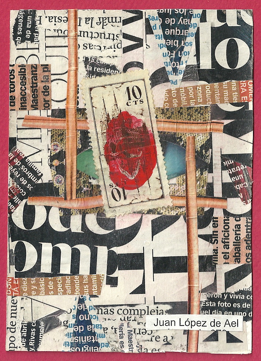
Mail art by Juan Lopez de Ael (Vitoria-Gasteiz, Pais Vasco, Spain)
In the last year, we have become familiar with visual poetry by Juan Lopez de Ael and admire it very much. He is, in our estimation, a master of the cut-up. So we are absolutely thrilled to have received this postcard-size piece, which is an original composition, not a copy. Like many visual poets and text-centered artists, Juan Lopez de Ael is an active participant in the Eternal Network.
In the work of Juan Lopez, we see an affinity to William S. Burroughs’ cut-ups and thus earlier DaDa prototypes. But Juan Lopez de Ael also departs from Burroughs significantly. The work of Juan Lopez is less linear and more dependent on the concept of defamiliarization. We see strong affinities to concrete poetry and those poets who focus on the materiality of language. Juan Lopez uses much material that comes from the mass media, and his work can be viewed as an interrogation of this public discourse and its visual manipulations (fonts in particular).
One should not overlook the recombinant and transformative nature of visual poetry by Juan Lopez de Ael. These literal deconstructions result in explorations of alternative syntax, the non-linear and the creation of whole new symbols. The result is more than base distortion. In the context of the current interest in asemic writing, the work of Juan Lopez de Ael deserves consideration.

Deepest thanks to Juan Lopez de Ael for being so thoughtful and sending an original work!
27 Jun 2015
by minkrancher
in anti-art, anti-poetry, asemic poetry, asemic writing, calligraphy, collage, conceptual art, conceptual poetry, concrete poetry, experimental writing, found art, mail-art, poetry, post-neo, Trashpo, visual poetry
Tags: asemic poetry, asemic writing, asemics, calligraphy, collage, conceptual art, conceptual poetry, conceptual writing, concrete poetry, correspondence, experimental writing, mail-art, post-neo, trashpo, visual poetry

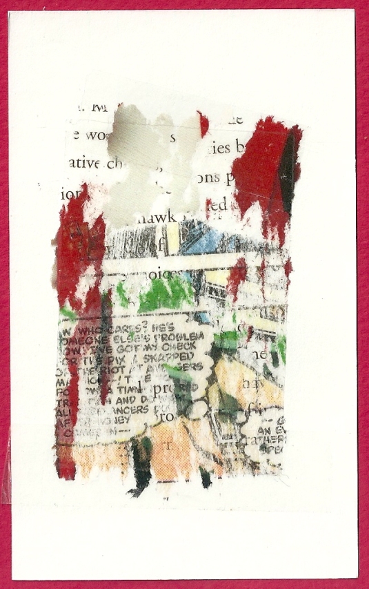
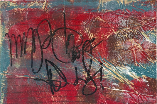
Mail art by Jim Leftwich (Roanoke, Virginia, USA)
We are happy indeed to share with Tenderfoots a group of five visual poems received from Jim Leftwich. They tend toward the text-centric and are composed using a tape transfer technique. This method allows for image-text integration, overlaying, distortion and excellent textures. The pieces are taped on cards with a dimension of approximately 3 X 5 inches.
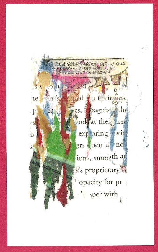
Jim Leftwich uses appropriated materials in these visual poems. The tape transfer adds the element of chance operations to the process. The result is not unlike what is produced by the cut-up technique as practiced by Brion Gysin, William S. Burroughs and Harold Norse. Both insights and radical dislocations can be experienced. With these pieces, Jim Leftwich is able to achieve stronger text-image synthesis than classic cut-ups that often focus on some degree of linearity and conventional “reading.”
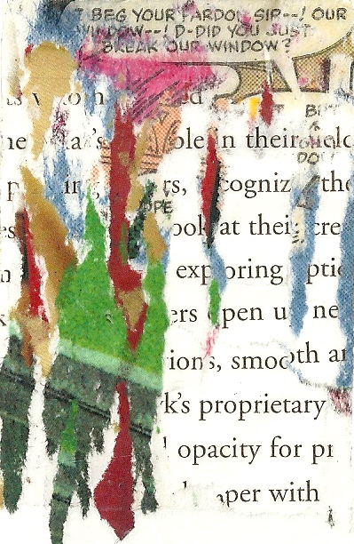
Detail of tape transfer vispo by Jim Leftwich
In the context of mail art, the use of comics makes a reference to popart and thus Ray Johnson, even if inadvertent. On another level, the pieces use the discourse of popular culture and textbook-like discourse. As a result, both standard discourse and logic are disrupted and interrogated. New symbols frequently emerge from the various decompositions of language.
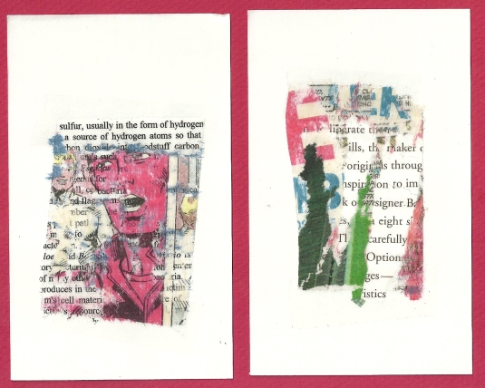
These pieces emphasize the materiality of language as well.
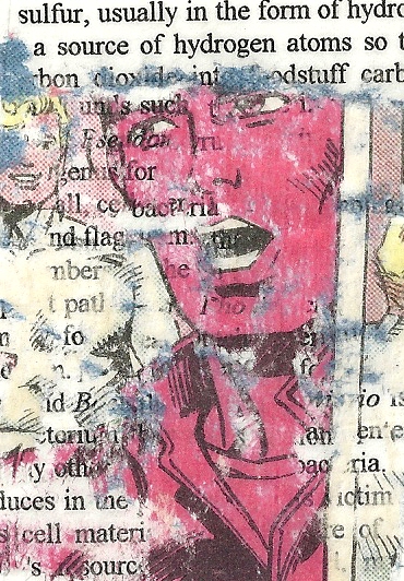
Detail of vispo by Jim Leftwich
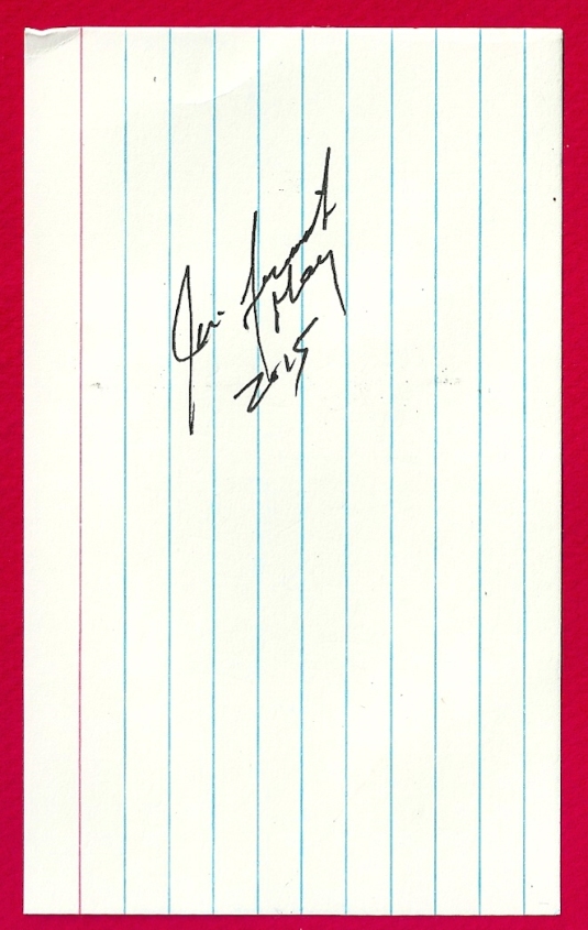
All the pieces are signed:
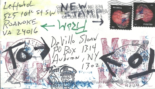
And the envelope:
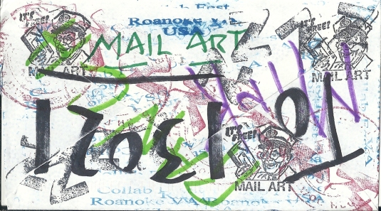
And the reverse:
Many thanks to Jim Leftwich for sending us this great work!
22 Jun 2015
by minkrancher
in anti-art, anti-poetry, asemic fiction, asemic poetry, asemic writing, calligraphy, collage, conceptual art, conceptual poetry, mail-art, visual poetry
Tags: asemic fiction, asemic poetry, asemic writing, asemics, calligraphy, collage, conceptual poetry, conceptual writing, correspondence, mail-art, visual poetry
Mail art by Terry Owenby (Portland, Oregon, USA)
Tenderfoot Terry Owenby kindly sent us this beautiful postcard-size work. She has an ongoing interest in asemic writing and art. This piece, we believe, uses an unconstrained and highly expressive street art approach. The background, which has distressed tonal qualities, reveals the affinity between abstract art and asemics. The straight lines in the background form an interesting synthesis between the asemic calligraphy and the painting. We are thrilled to have this and think it is a beautiful piece. Anti-art scratches also have a correspondence to the writing. Terry Owenby included a very nice note with the work:

Explanations such as this in mail art are appreciated but not necessary. Correspondence art is fun and rewarding, but it is also very demanding. The majority of participants take time off for varying durations and in various ways. Terry Owenby has, indeed, been a faithful member of the IOUMA asemic writing group and contributor to our humble blog. Keep in touch as well as you can, Terry. Many thanks!
16 Jun 2015
by minkrancher
in anti-art, anti-poetry, asemic poetry, asemic writing, collage, conceptual art, conceptual poetry, concrete poetry, mail-art, photography, poetry, stamps, Trashpo, visual poetry
Tags: asemic poetry, asemic writing, asemics, collage, conceptual art, conceptual poetry, conceptual writing, correspondence, mail-art, poem, poetry, trashpo, visual poetry
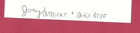
Mail art by Joey Patrickt (Oakland, California, USA)
We have praised Joey Patrickt for his West Coast surrealism in previous blogs. In this posting, we recognize his versatility. He sent us a package of text-oriented pieces that match the MinXus-Lynxus visual poetry aesthetic perfectly. Of course, we do not insist that our correspondents toe a party line – far from it – but we do appreciate work that reacts in various ways to theories and concepts we propose, even when it is parody (as in the case of David Stafford). The piece above, for instance, uses overlays, disruption and distortion to reach the border between the comprehensible and the incomprehensible, which is the realm of the asemic. We also like this postcard-size piece a great deal:
One section we like especially:
Joey Patrickt has disrupted the process of signification, logic and syntax to the extent that we are left to view the debris of language construction as a visual image in that it cannot be “read” in a conventional way. But the ghost of language is insistent, and the shapes seem to be captured in a process of reforming into new symbols. Regardless of whether found, random or whatever the source, we believe this is a very effective concrete poem. The focus on a single line is a novel approach, and the smudging – the merging of the abstract signifiers with the physical page – certainly emphasize the materiality of the work. The piece is apparently a collab because we found this on the reverse side:
Joey Patrickt also enclosed some Trashpo related to the visual arts and writing:
The envelope:
And the reverse:
Many thanks to Joey Patrickt for an excellent textual-visual mail art package with some great conceptual material and some humor as well.
13 Jun 2015
by minkrancher
in anti-art, anti-poetry, asemic writing, collage, conceptual art, conceptual poetry, concrete poetry, events, experimental music, experimental writing, Fluxus, found art, haptic poetry, mail-art, mail-art calls, minimalism, neoism, object poetry, performance art, poetry, post-neo, stamps, Trashpo, visual poetry, zines
Tags: asemic writing, asemics, collage, conceptual art, conceptual writing, correspondence, fluxus, found art, mail-art, neo, neoism, performance art, post-neo, stamps, trashpo, visual poetry
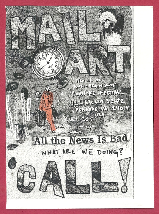
Some Tenderfoots know him simply as “Jesus Jim,” inventor of Trashpo.
Others know him as Jim Leftwich, a visual poet and theorist of great distinction. Regardless, if you visit our humble blog then you are called upon to send mail art to this year’s event in Virginia, which is associated with the former Marginal Arts Festival.
Note that the deadline is June 27, 2015!
MAF
422 Walnut SE#2
Roanoke, VA 24014-USA
For more information:
http://postneoabsurdism.blogspot.com/
03 Jun 2015
by minkrancher
in anti-art, anti-poetry, asemic fiction, asemic poetry, asemic writing, calligraphy, conceptual poetry, experimental writing, mail-art, visual poetry
Tags: asemic fiction, asemic poetry, asemic writing, asemics, calligraphy, collage, concept art, conceptual poetry, conceptual writing, correspondence, mail-art, visual poetry
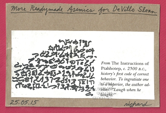
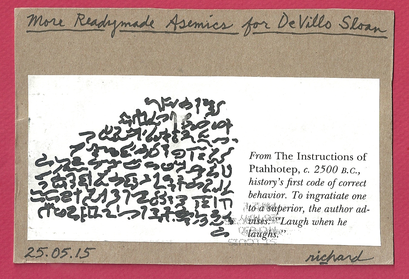
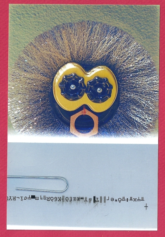
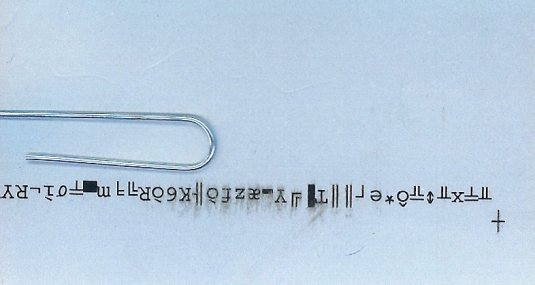
Mail art by Richard Canard (Carbondale, Illinois, USA)
Riding yet another post-avant wave with characteristic adeptness, Richard Canard has donned his shades and made another foray into the realm of the readymade asemic (which is an eroded beach property that is becoming increasingly his personal territory due to squatter’s rights).
He sent us this (apparently) found material that is meant to be an approximation of ancient Egyptian hieroglyphics. We had to look it up, but we do confirm the reality of Ptahhotep’s instructions. Whether these hieroglyphs are accurate or legible would become a key question, were this readymade to be cast into the arena of asemic scrutiny. Minus the following paragraphs, we will avoid theoretical discussions and enjoy the mail art.
Right now there is a great deal of interest in asemic writing in both the Eternal Network and (often overlapping) visual poetry community. Most online discussions gravitate toward the question of what makes something asemic. As we have proposed in other venues, work that is “asemically correct” (that would satisfy the most hardcore purist) cannot be read or understood using conventional modes of reading; however, that does not exclude asemic writing from being expressive. These discussions can become heated and often involve dizzying definitions and complex qualifications involving the definitions.
A constant in asemic writing, though, is the requirement that the material have “no semantic content,” an idea we present via Michael Jacobson. Some sidestep the language issue by writing about “asemic art” or claiming asemic writing is a ruse and should be considered abstract art. Even more perspectives exist, but we have already expounded too long and too far on the subject.
We are very pleased to be able to add Richard Canard’s readymade asemics to the growing canon of asemic writing.
Previous Older Entries